Agency
Skincare
by Curology — 2024
Building a paid social creative system from scratch for a brand-new prescription skincare label — one that had to earn trust fast in one of the most crowded categories on the internet.
Background
The Brand
A new brand.
A crowded market.
No room to blend in.
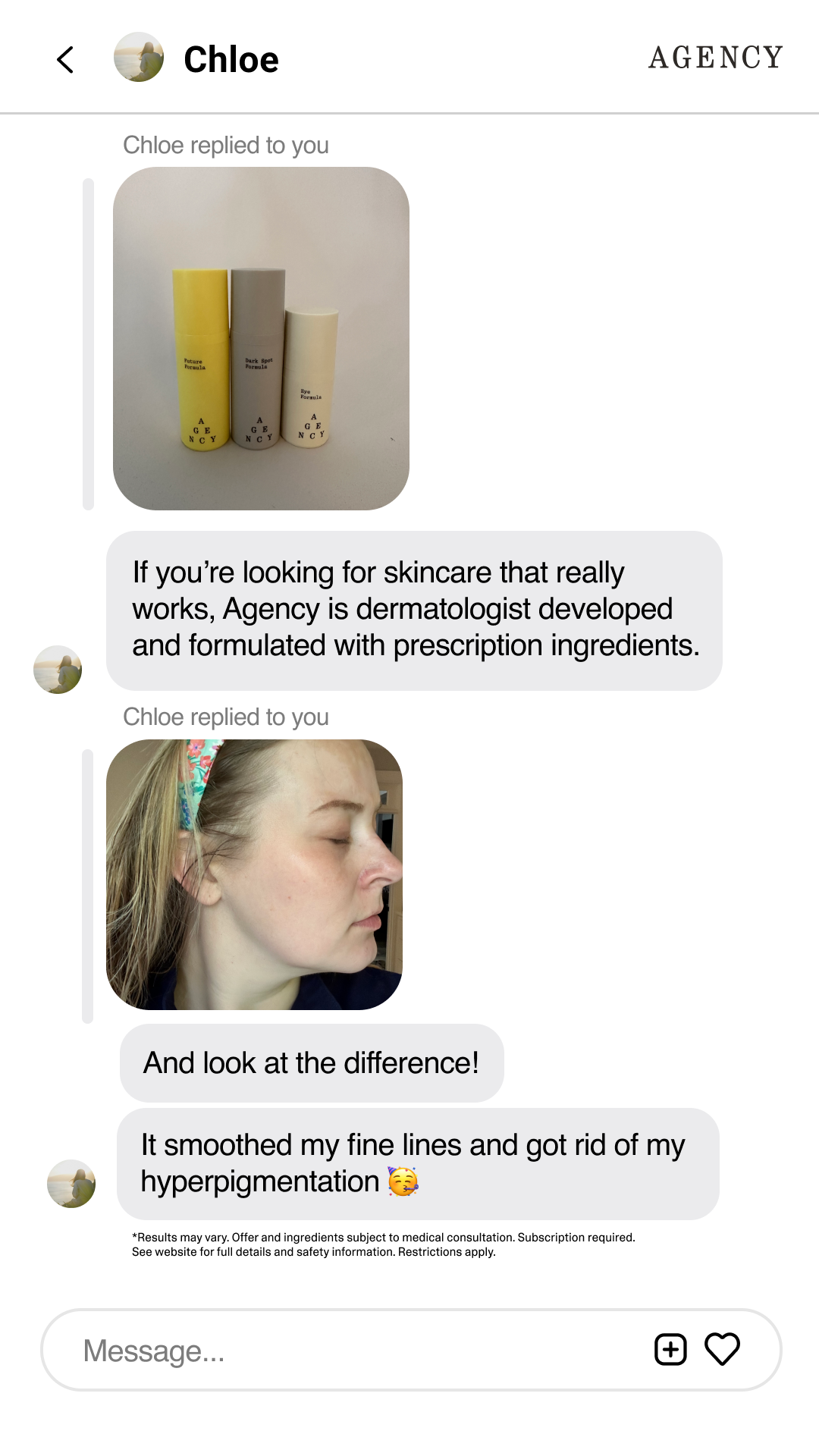
Agency is a prescription anti-aging skincare brand by Curology — built for adults 35+ who want clinically proven results without a complicated routine. Personalized Rx formulas for wrinkles, dark spots, and fine lines, prescribed by licensed dermatology providers and shipped to your door.
Unlike Curology, which had years of brand recognition and a deep library of creative assets, Agency was new. The name recognition wasn't there yet. The asset bank wasn't there. And the expectation to perform week over week absolutely was.
Working as a designer within a larger creative team, I was responsible for producing paid social assets across every major format — static and motion — while helping to shape the visual identity of a brand still finding its footing.
Core challenges
- 01Carving out an identityAgency needed to feel distinct from Curology while sharing the same clinical credibility — two audiences, two different tones, one parent company.
- 02Designing for a 35+ audienceThis audience is skeptical and savvy. Trust couldn't just be claimed — it had to be communicated through the creative itself.
- 03A thin content libraryCurology had thousands of assets. Agency had almost none. Every campaign had to be built from limited material, produced fresh every week.
- 04Stopping the scrollPrescription skincare is one of the most saturated spaces in paid social. Generic creative doesn't survive. Attention had to be earned immediately.
Design Decisions
Every choice
had a reason
behind it.
The creative direction came from the top down — but execution left real room for problem-solving. Here's where the thinking happened, and why the decisions we made (and I pushed for) worked.
Callout-style ads over lifestyle imagery
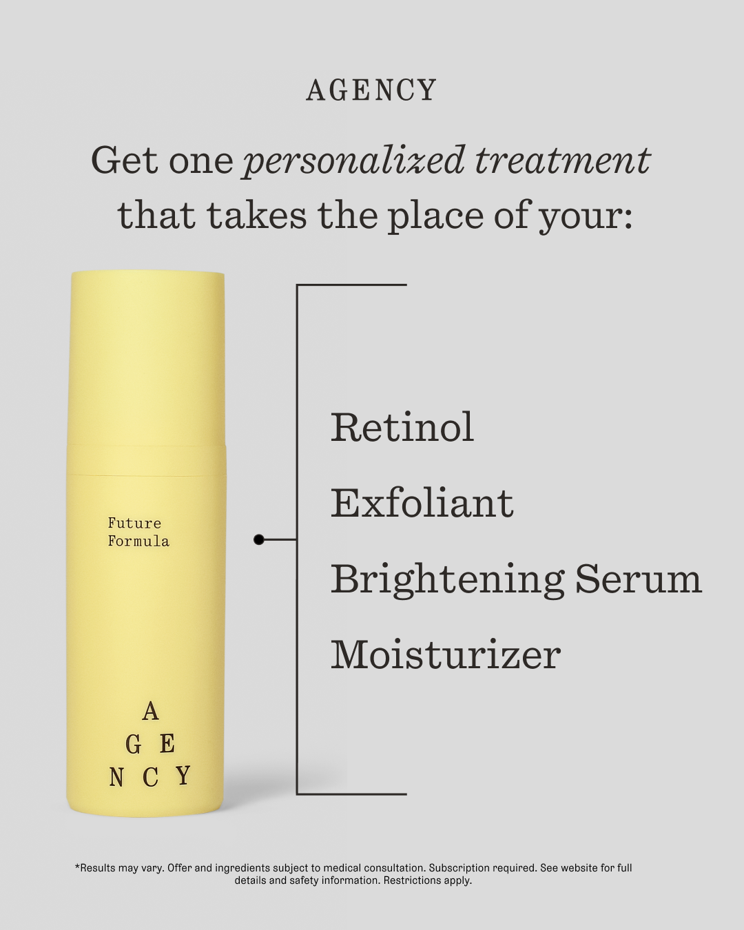
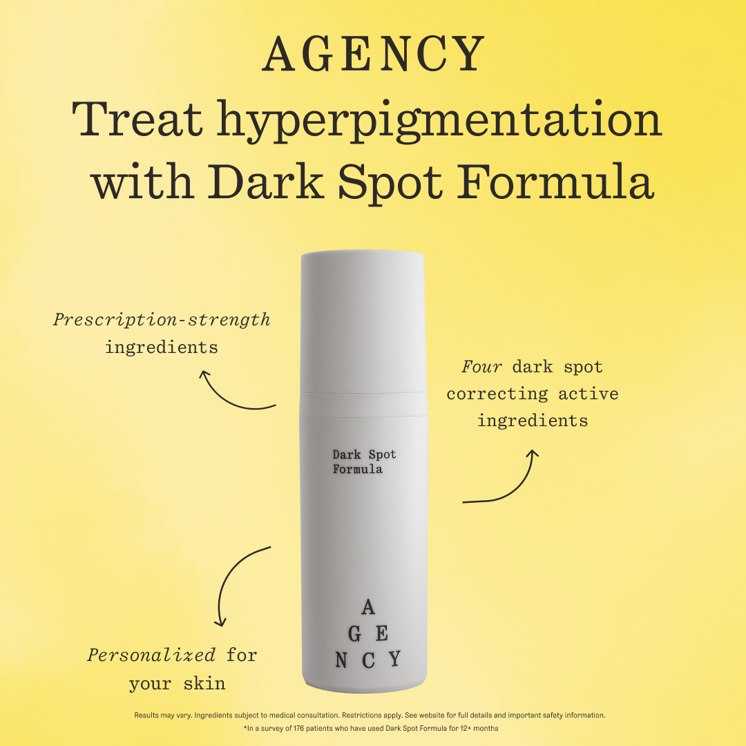
The 35+ audience doesn't want to be sold a fantasy — they want to know exactly what a product does. We made a deliberate call to lead with ingredient callouts and specific benefit claims, so a viewer could absorb everything they needed in a single glance. The goal was to remove friction entirely: one product, multiple proven benefits, no guesswork. That sense of comprehensiveness was the trust signal in itself.
Audience StrategyYellow on near-black — a contribution I pushed for
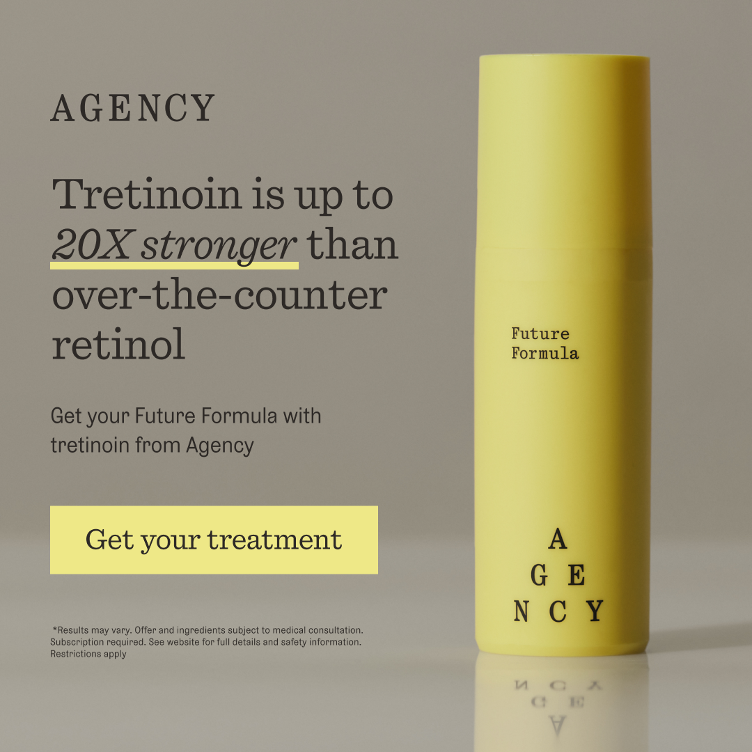
The brand direction leaned into yellow as a signature color, but I took it further: high-contrast yellow typography on a deep charcoal-black background. In a feed full of soft, pastel skincare creative, the contrast was immediately disruptive. It wasn't just stylistic — it was strategic. The treatment also gave Agency something Curology didn't have: a visual identity bold enough to stand entirely on its own.
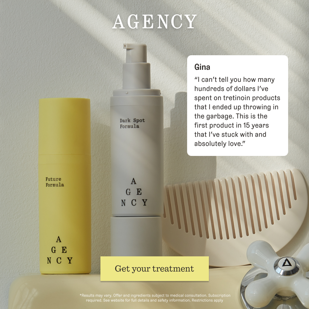
My InitiativeTrust builders as a creative pillar, not an afterthought
In an oversaturated market, trust is the conversion lever — especially for a prescription product with a new brand name. Testimonials, clinical language, and ingredient transparency were built into the creative hierarchy from the start, not layered on at the end. Combined with the yellow gradient treatment, leaning into these trust signals drove a 10% lift in static ad CTR.
Performance StrategyMotion from minimal — building more with less
Agency was new. There was no deep content library to pull from — a stark contrast to working on Curology, which had thousands of assets accumulated over years. Rather than let that be a bottleneck, we used a minimal combination of product photography and selective UGC to build motion ads that felt considered and brand-right. The motion pieces consistently outperformed static, proving that smart creative direction can outweigh raw volume.
Creative Problem-SolvingCreative Work
Across formats,
a single
consistent voice.
Every asset was built to serve a specific role in the funnel — awareness, trust-building, conversion — while staying visually cohesive week over week. Hover any image to see format details.
 9×16 Static1×1 Static
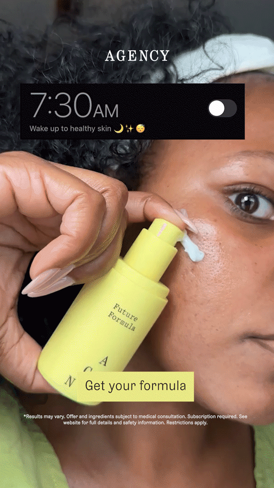 9×16 Motion
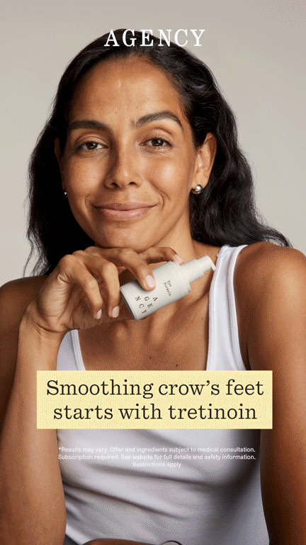 Motion1×1 — Trust Builder
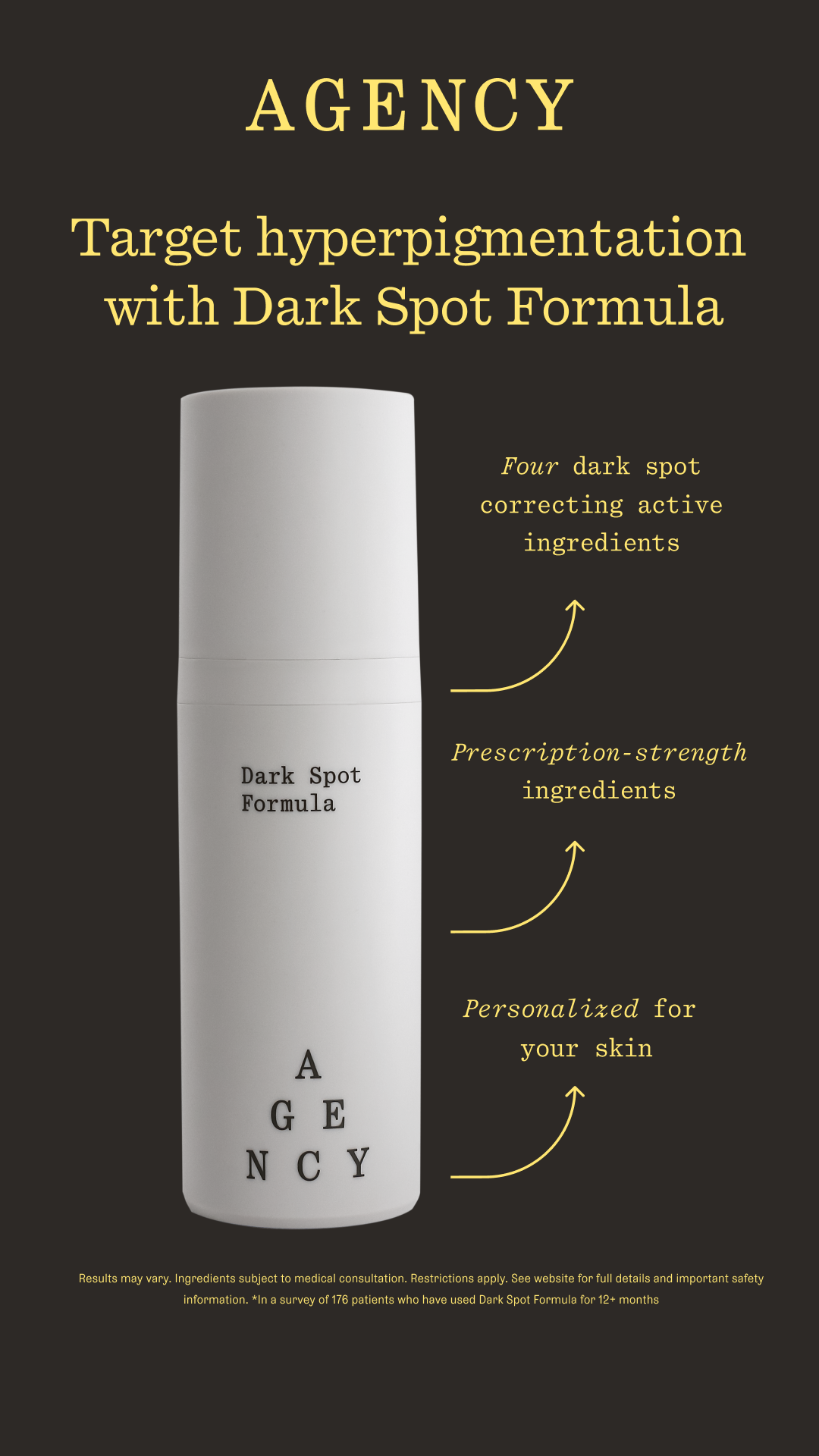 9×16 — Callout1×1 — Callout
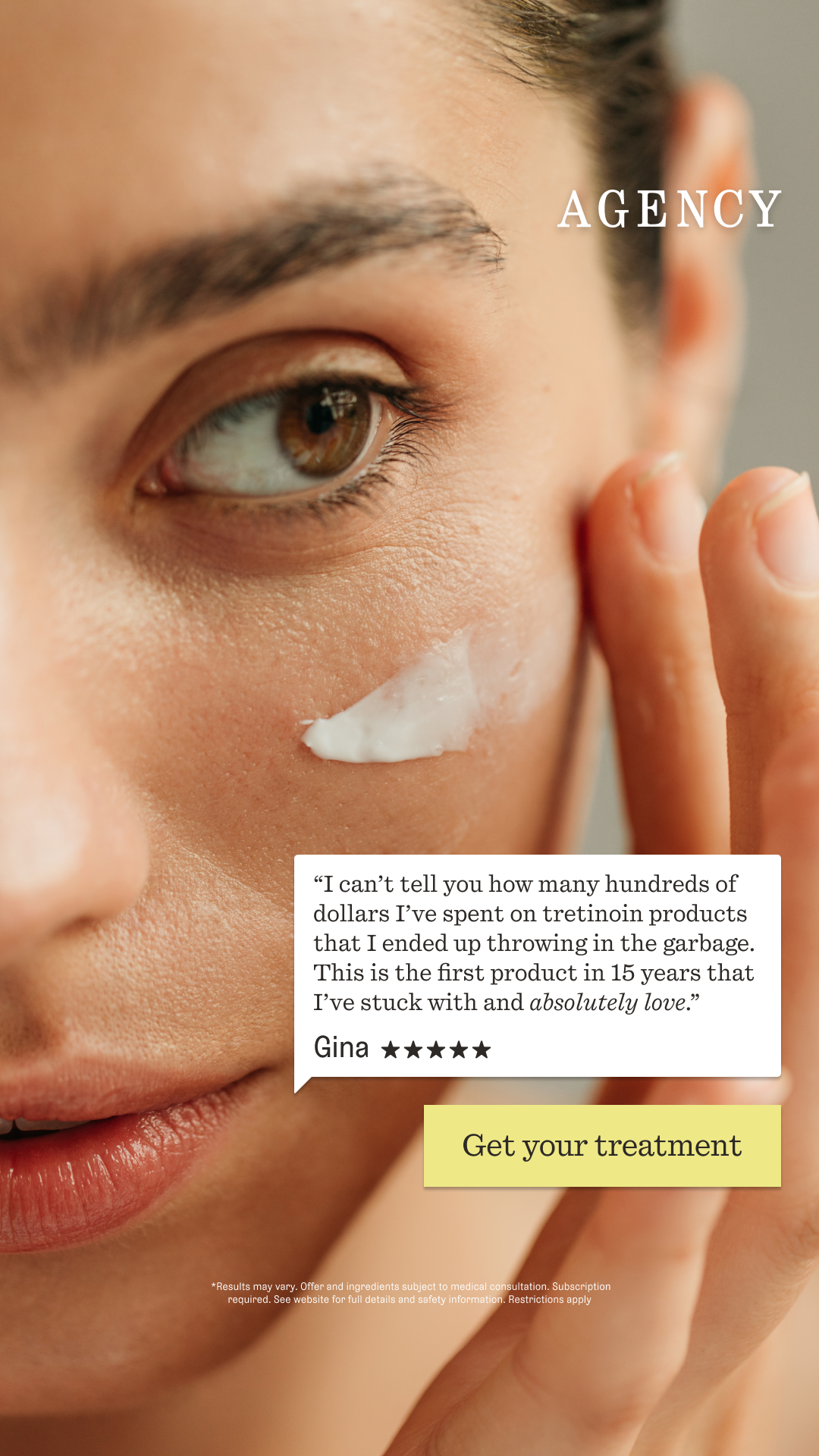 9×16 — Trust Builder
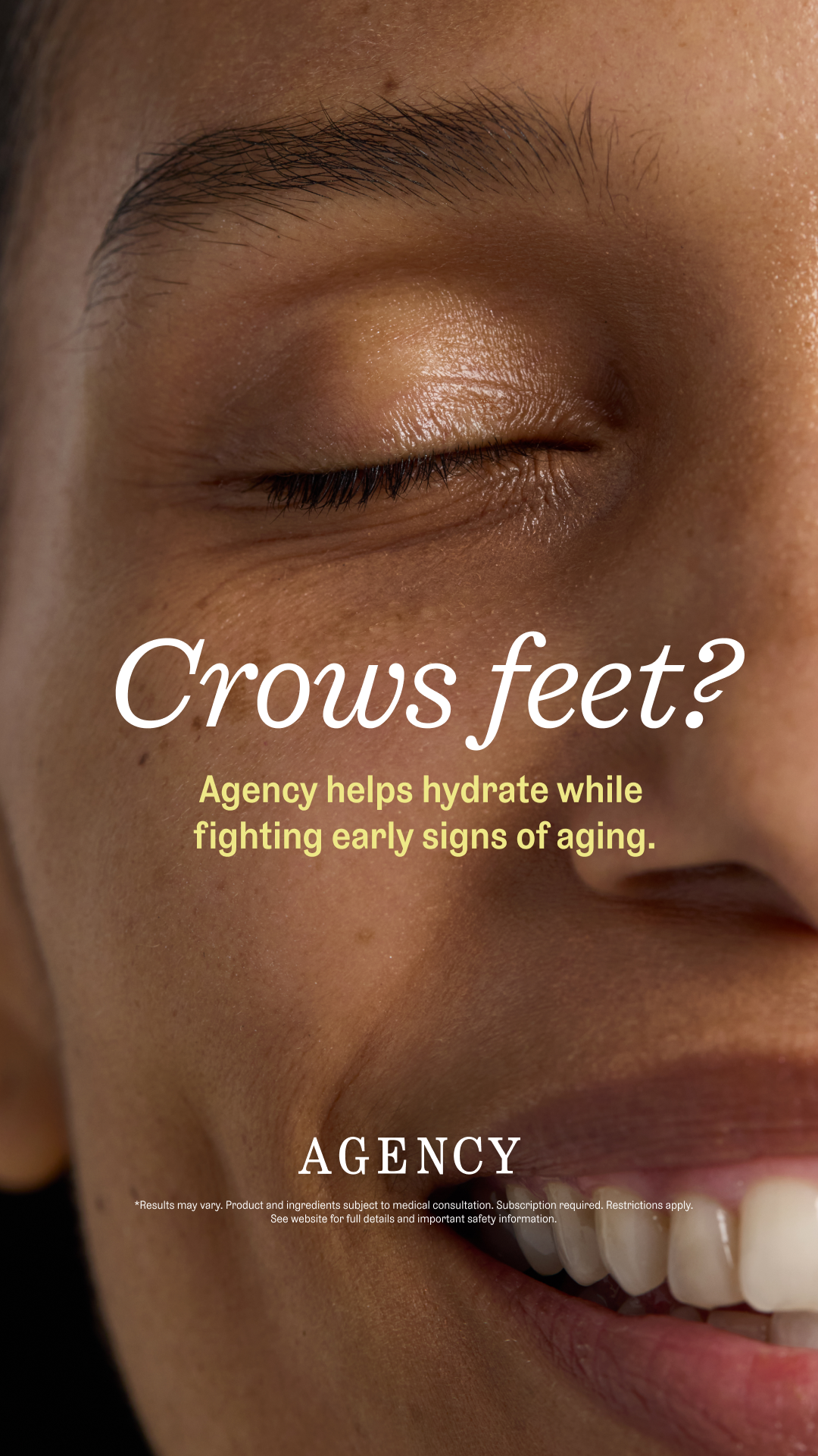 9×16 Static
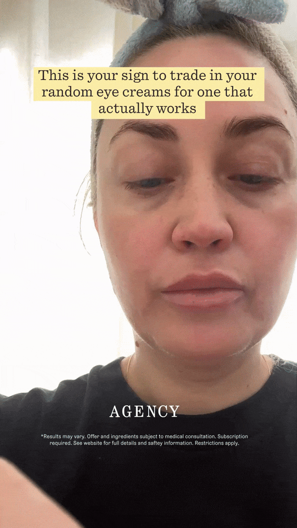 Motion
Process
Iteration as
a design tool.
With Agency, we didn't have the luxury of a long runway. Creative was produced and evaluated week over week, with performance data directly shaping what came next.
Top-down direction, bottom-up execution
The strategic direction — what to prioritize, which claims to lead with, what audience signals to amplify — came from above. My role was to translate that into creative that could actually perform. The space between brief and execution was where the real design decisions happened.
Weekly creative cycles, real-time feedback
Unlike Curology, which had an established playbook and years of performance data to draw from, Agency required rapid creative cycles with limited precedent. We shipped, watched the numbers, and adjusted. Fast feedback loops demanded creative flexibility without losing visual consistency.
Data confirmed: lean into yellow and black
As we iterated week to week, a clear signal emerged — the high-contrast yellow-on-near-black treatment was outperforming everything else in the mix. We leaned in deliberately. What started as an aesthetic instinct became a data-backed visual system, and ultimately the defining look of Agency's paid social identity.
Doing more with less on motion
Building motion creative for a new brand with a thin asset library was a genuine constraint. We used product photography and a minimal amount of UGC strategically — quality of use over quantity. The motion pieces consistently outperformed static, which proved that creative direction and intentionality can outweigh raw asset volume every time.
The market is oversaturated — you have to build connection and trust quickly through the visuals. Everything else is noise.Reflection on the Agency Skincare campaign — 2024