Designing for Retention: UX Experiments for Home Chef’s Digital Experience
While working with Home Chef, I collaborated with growth strategists to optimize the website experience. I contributed UX-focused design concepts aimed at improving user retention and engagement. Several of my test ideas were included in a larger strategic presentation and executed on-site as A/B tests.
Goals
Help users more easily compare plan options and savings
Increase personalization and flexibility in the meal selection process
Improve engagement through clearer, simpler UI
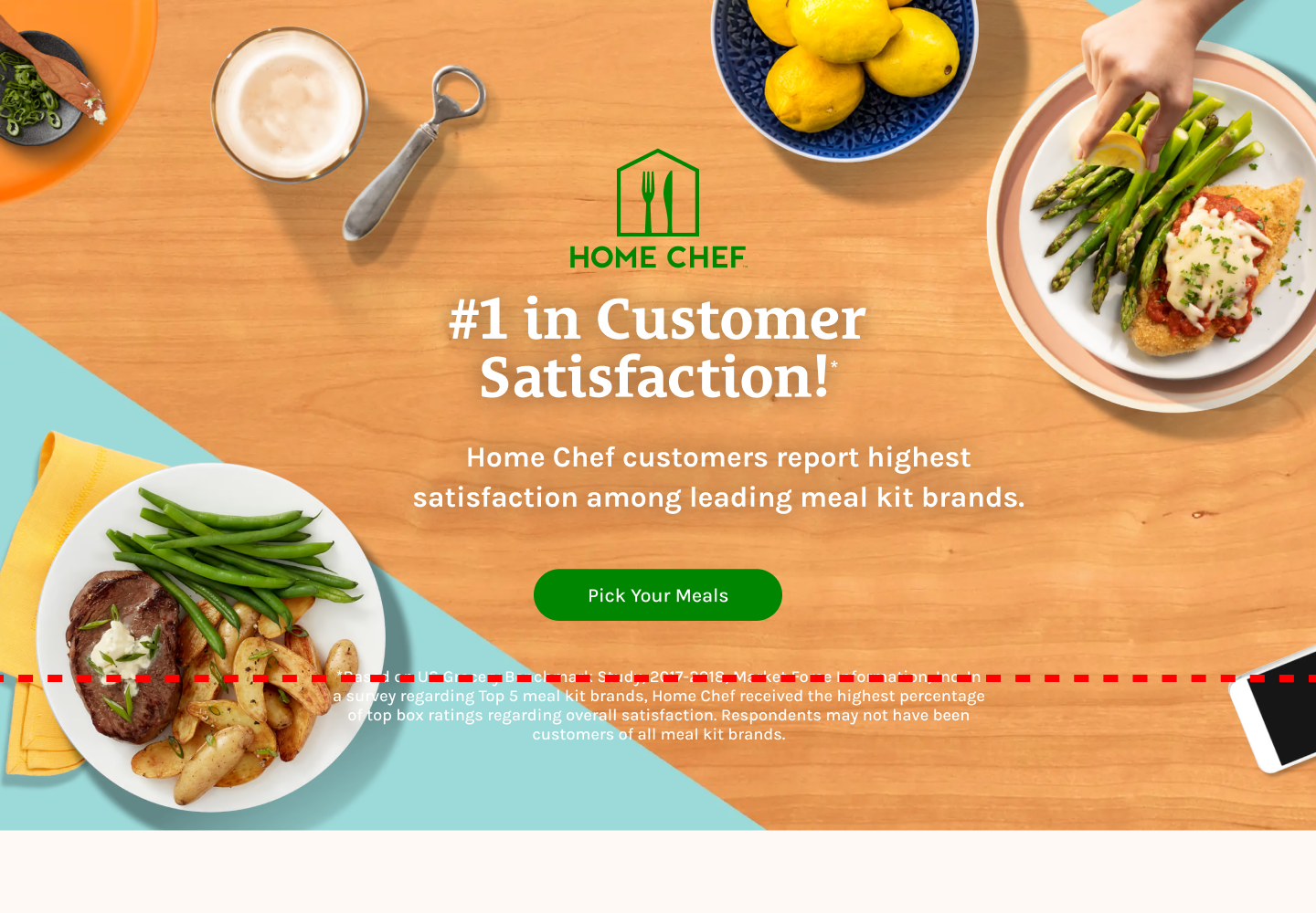
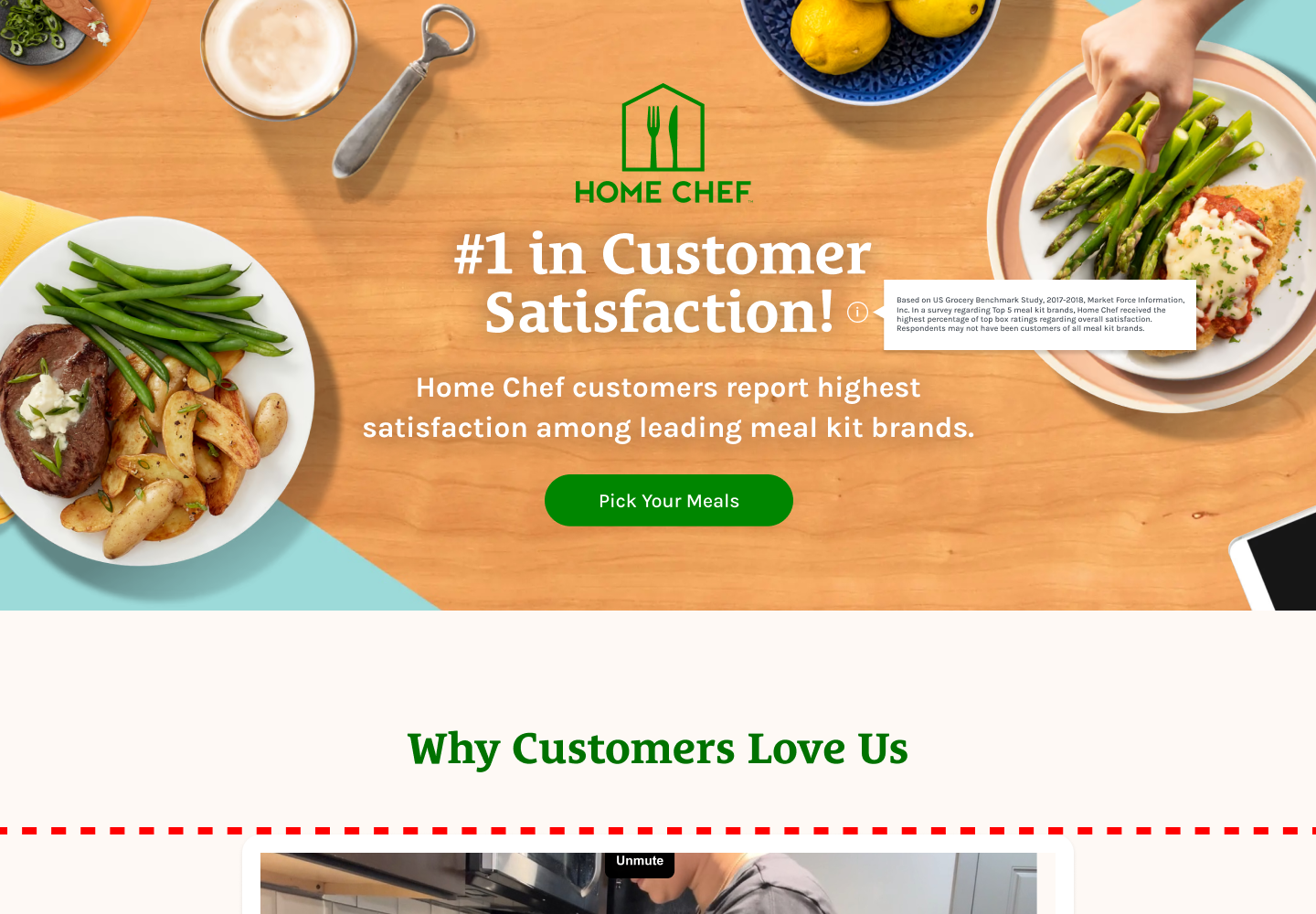
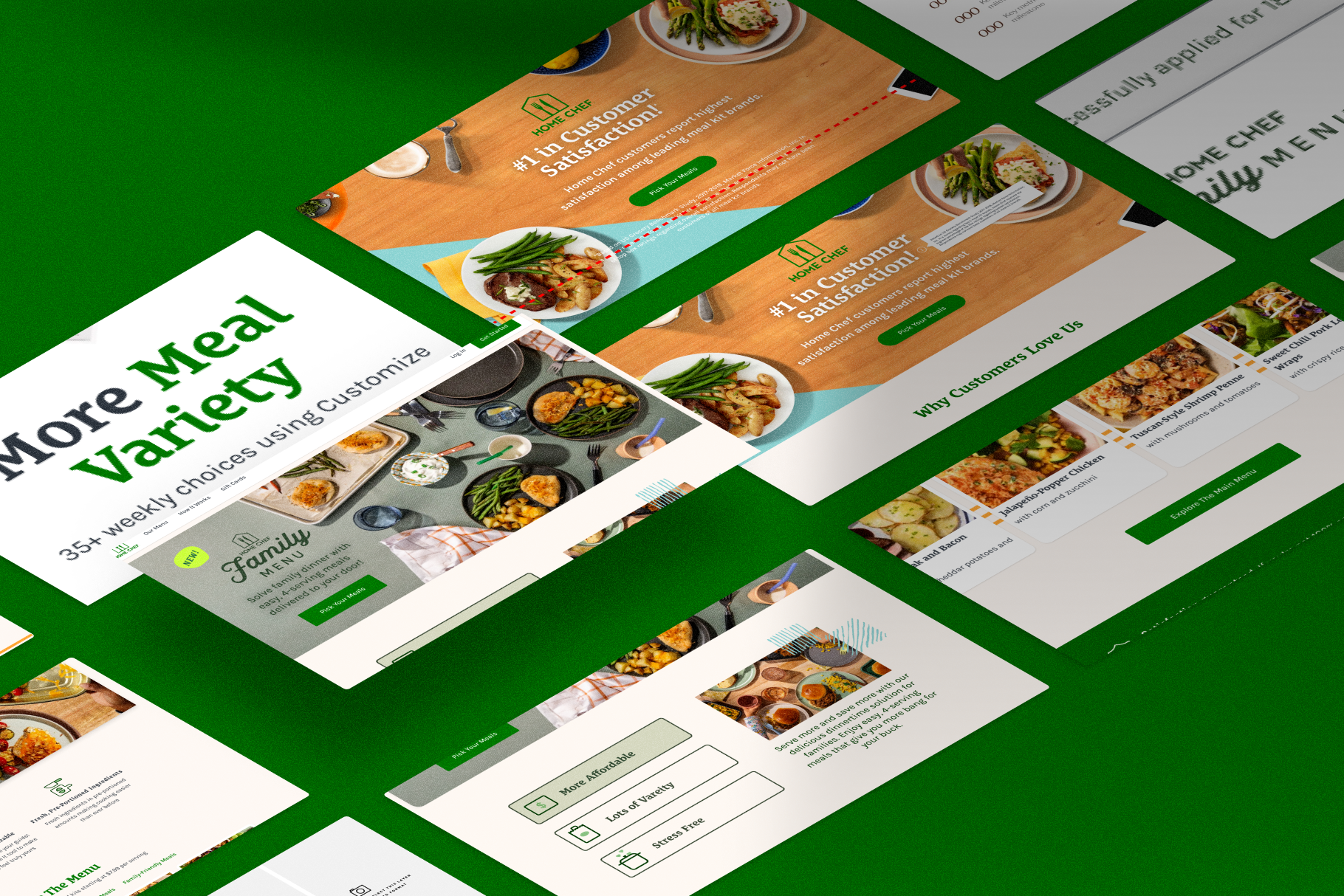
Test 1: Reducing Hero Clutter with Tooltip Legal Copy
Problem:
The homepage hero was crowded with lengthy legal disclaimers, pushing key messaging below the fold and limiting its visual impact.
Hypothesis:
Moving the legal text into a tooltip would create a cleaner, more impactful hero while still maintaining compliance.
Solution:
I designed a variation where the legal disclaimer was condensed into an icon-triggered tooltip, freeing up vertical space and improving first impressions.

Test 2: Switchable Plan Tabs to Improve Comparison
Problem:
Users couldn’t easily compare Home Chef’s core plan and family plan, leading to confusion and missed conversions.
Hypothesis:
Adding a tab navigation element to allow quick switching between plan types would help users find the best fit more easily.
Solution:
I created a tabbed interface that let users toggle between plan options on the pricing section, improving visibility and comparison.
Test 3: Redesigning the Discounts Page for Clarity
Problem:
The discounts and referral page was redundant and difficult to skim, with unclear value propositions.
Hypothesis:
By reducing copy repetition and using a visual breakdown of the weekly savings, users would better understand the program’s value.
Solution:
I redesigned the layout to include a step-by-step visual guide showing how the discount is applied over time.