Designing for
LumiMeds
Art direction, brand identity, and performance creative for a GLP-1 company lost in a sea of sameness. Redesigned to stand out, feel accessible, and convert.
01 — Brand Identity
Standing out in a market where everyone looks the same
When LumiMeds came to me, the GLP-1 space was flooded with brands following the same playbook: cool blues, sterile whites, and a clinical tone that kept patients at arm's length. Every competitor looked like a variation of the last. LumiMeds' existing brand wasn't just underperforming, it was invisible.
My diagnosis: the brand lacked any real personality, and nothing about it communicated the thing that actually set LumiMeds apart, price accessibility. Patients who could finally afford GLP-1 treatment deserved a brand that felt like it was made for them.
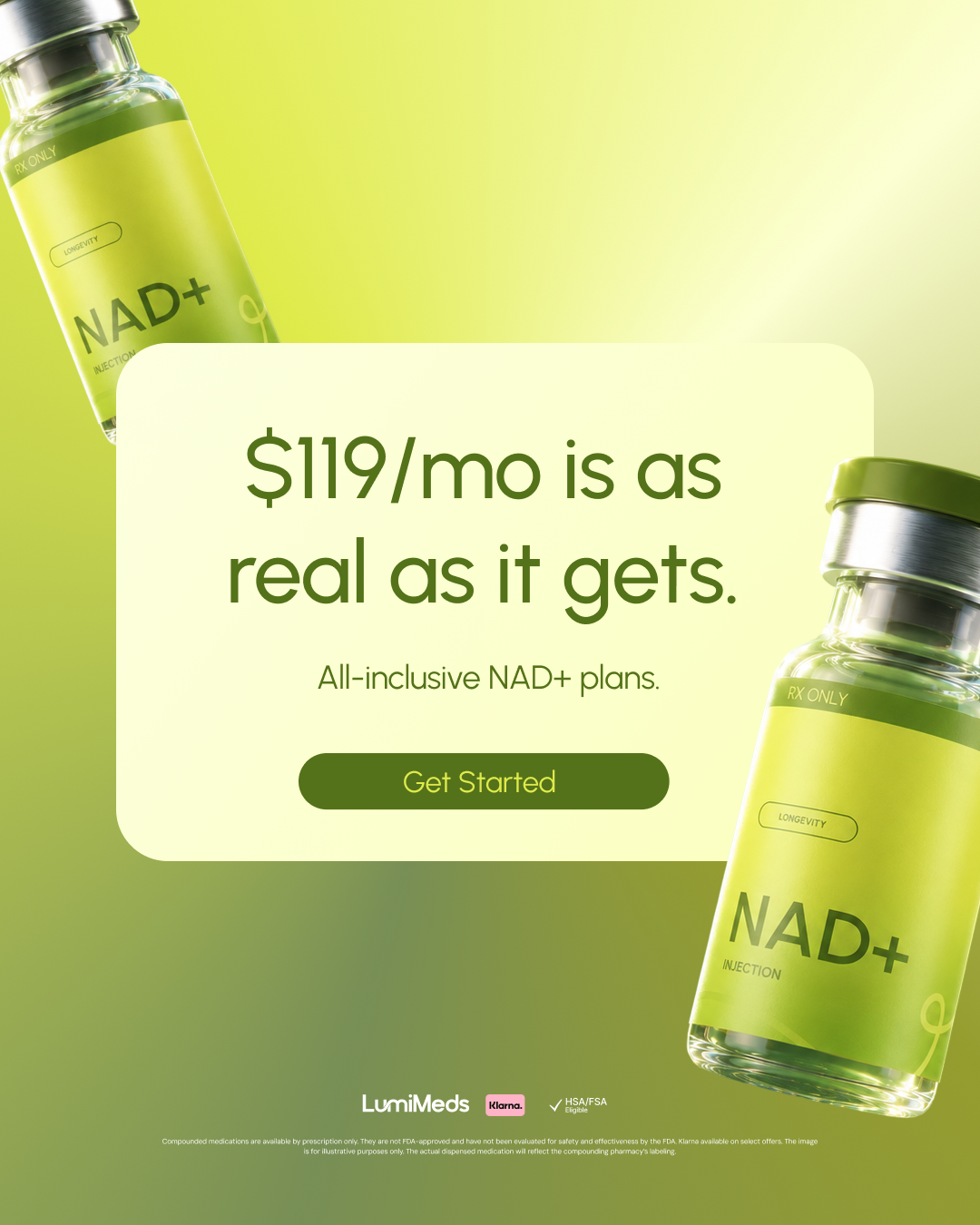
I presented multiple creative directions before landing on the one that clicked immediately with the client: bold, saturated color as the hero. The rebrand gave LumiMeds something no competitor had, a distinct visual identity that felt genuinely welcoming.

“Bold color wasn’t just an aesthetic choice — it was a strategic one. In a sea of clinical sameness, warmth and energy become a competitive advantage.”
02 — Team Leadership & Digital
Setting the direction, then building the system to execute it
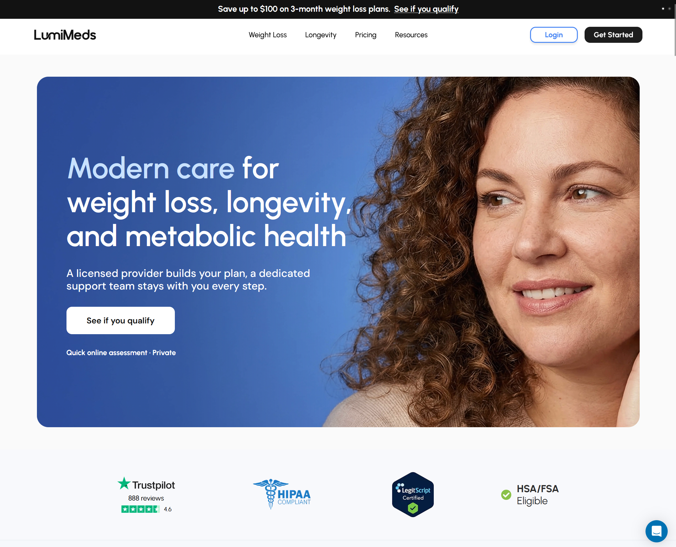
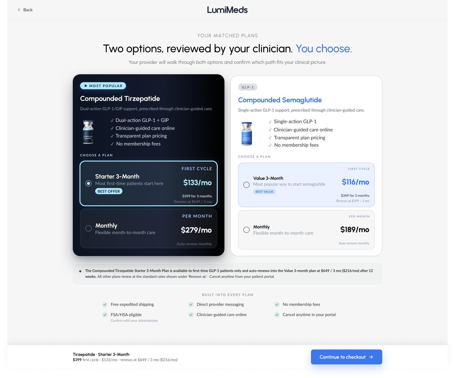
Once the brand identity was locked, I led art direction for LumiMeds' new website, setting the visual direction for color application, typography hierarchy, and how the brand's energy translates into a digital layout. I worked closely with the team to bring that direction to execution, making sure every page felt like an extension of the brand system rather than a separate design effort.
This is where identity work earns its keep. A brand isn't finished when the logo ships, it's finished when someone can land on a page and immediately feel the same thing the brand is supposed to make them feel. This is what the team was able to execute under my Art Direction.
Credits to the excellent team at LumiMeds for executing the development of this website.
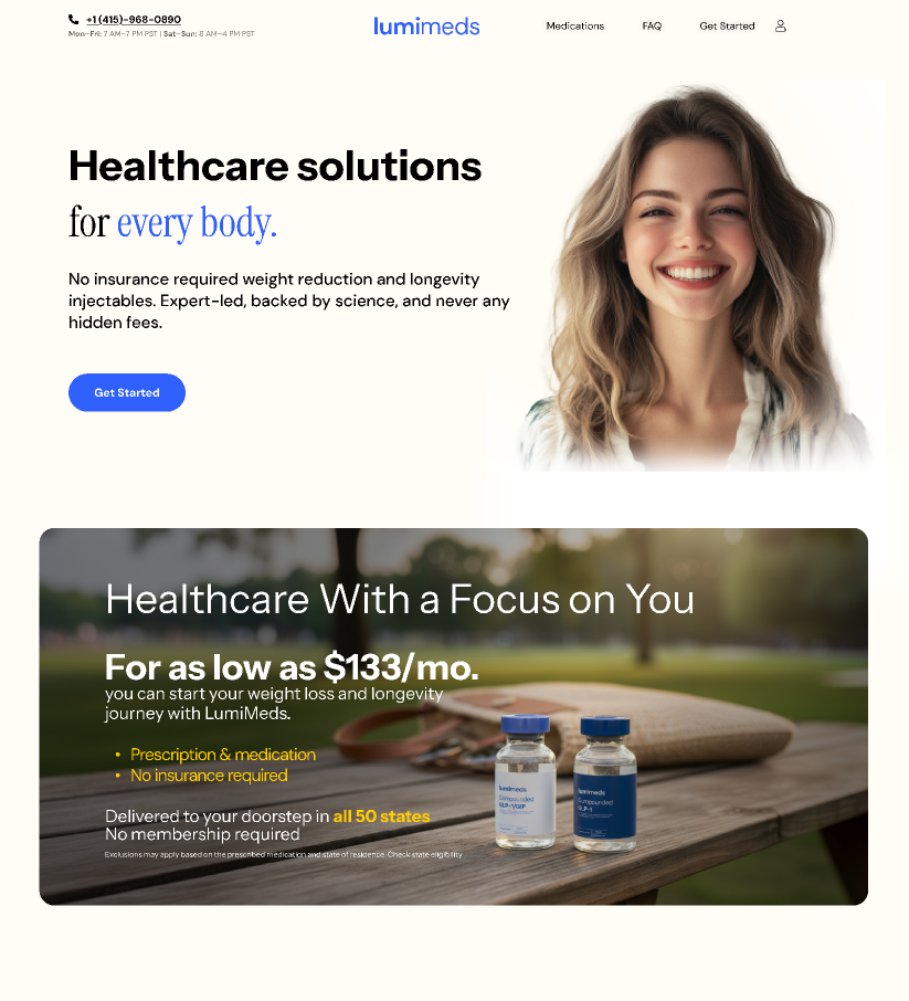
A snapshot of the old LumiMeds website before the brand overhaul.
03 — Performance Creative
Ad creative that consistently converts
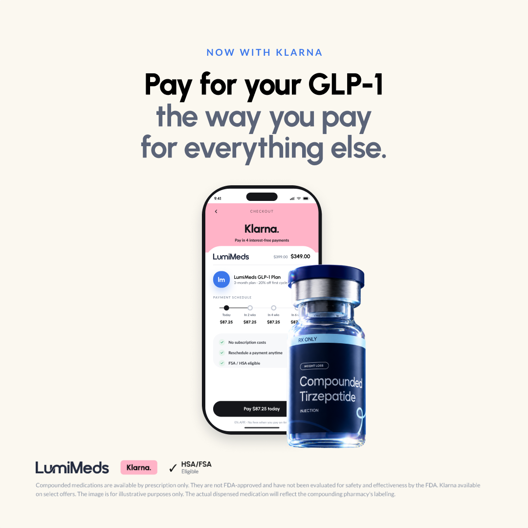
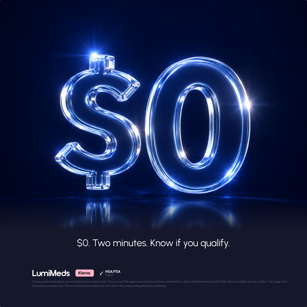
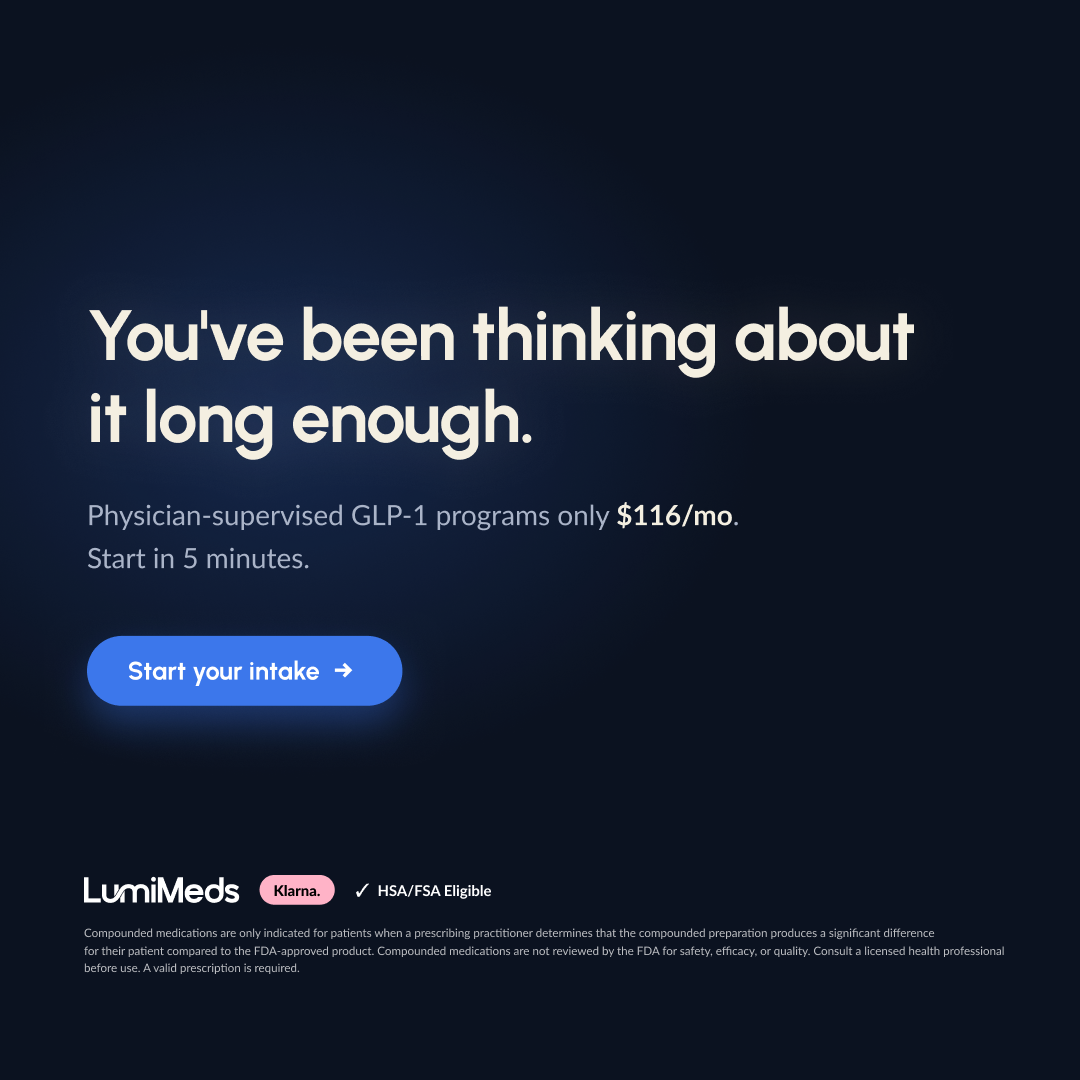
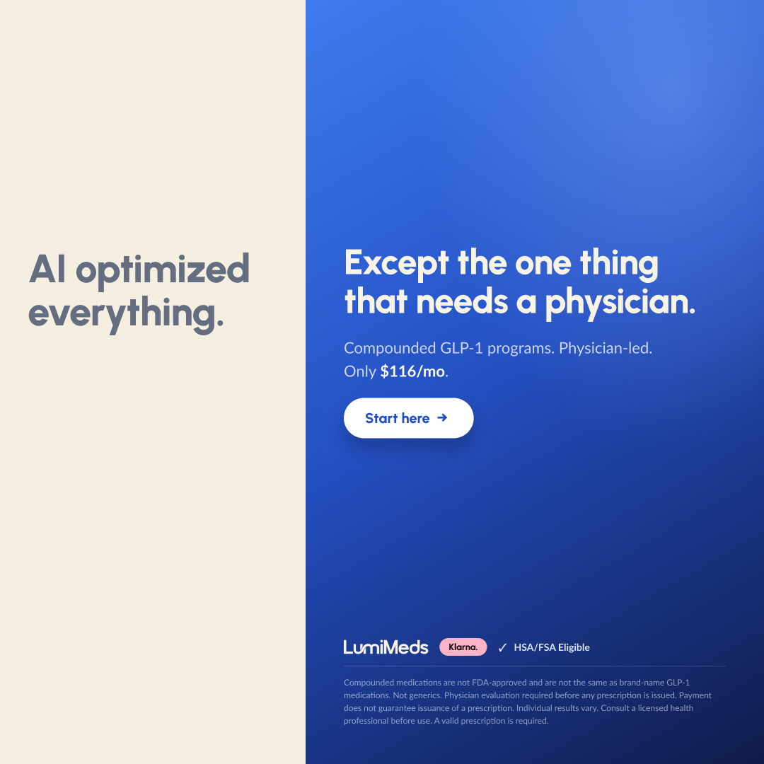
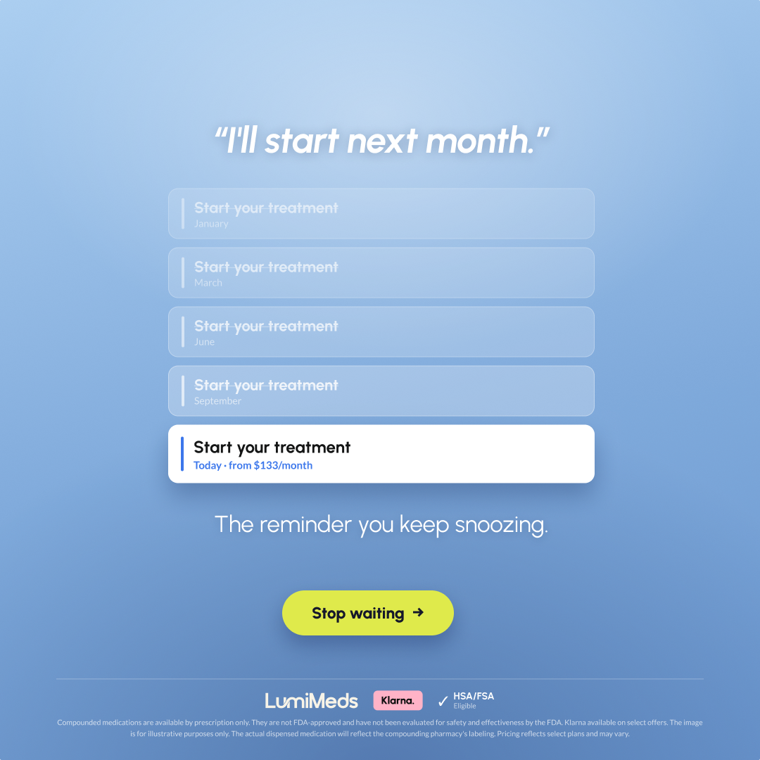
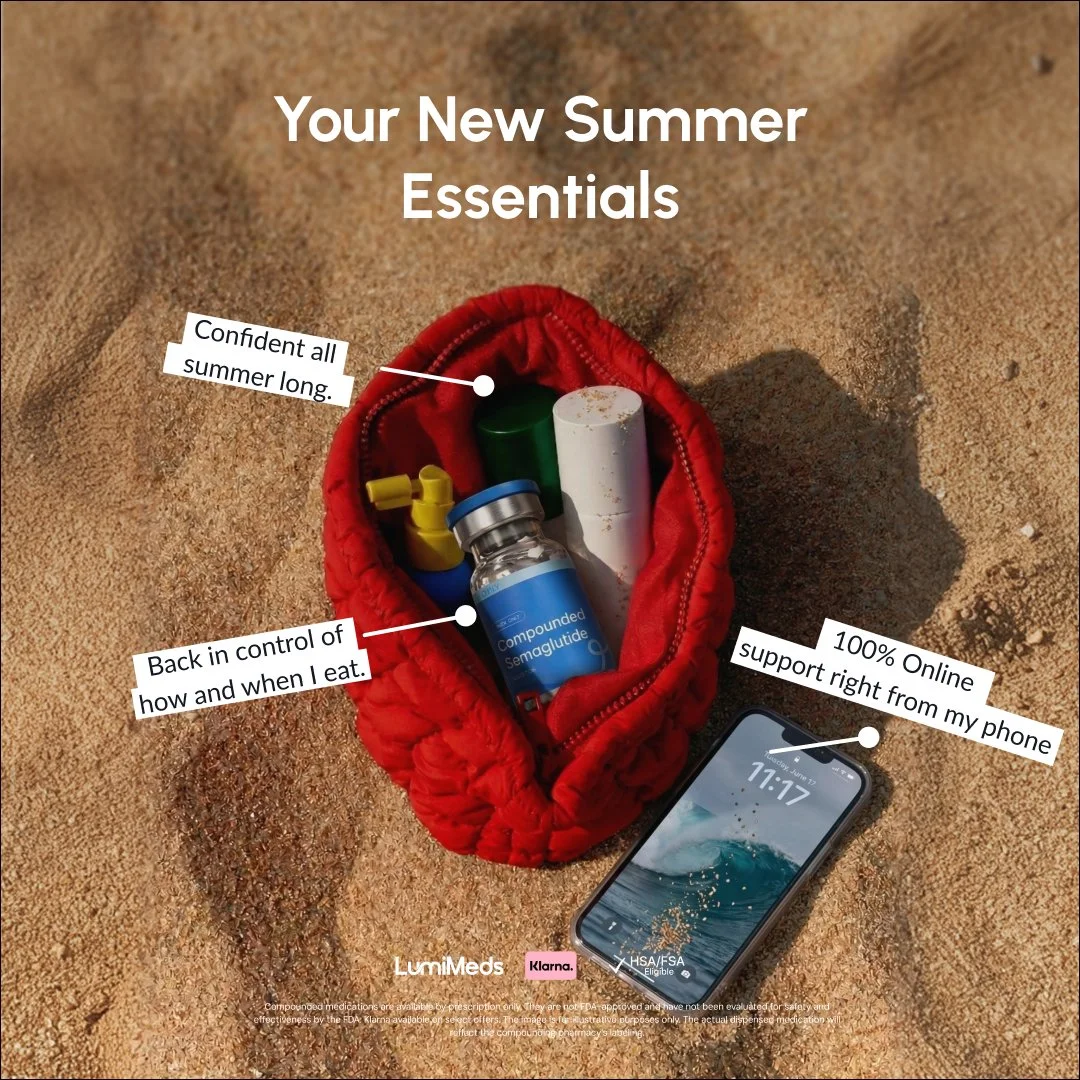
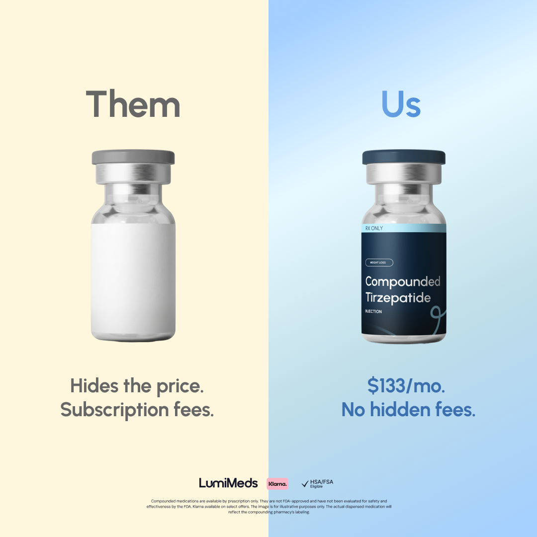
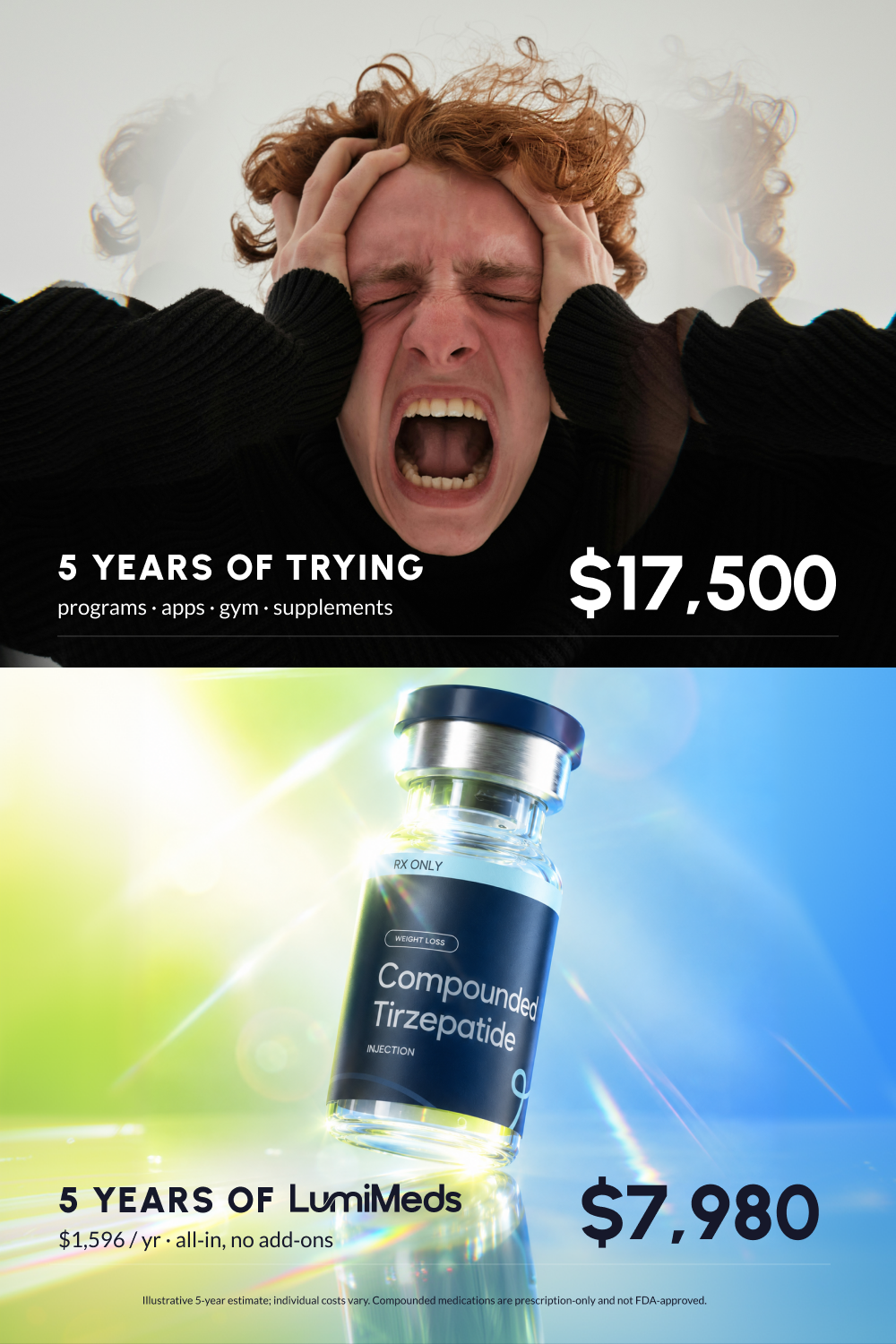
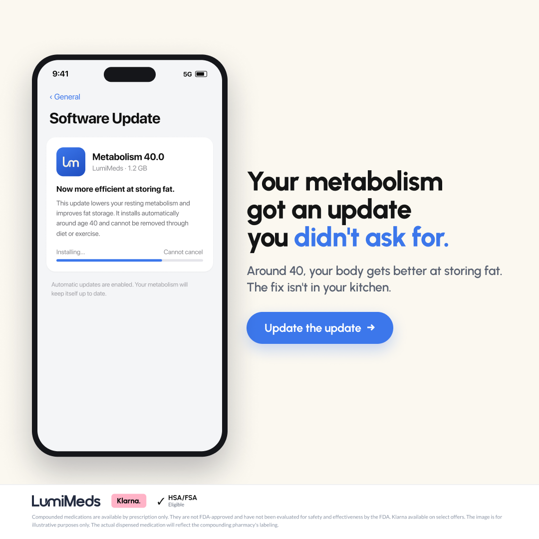
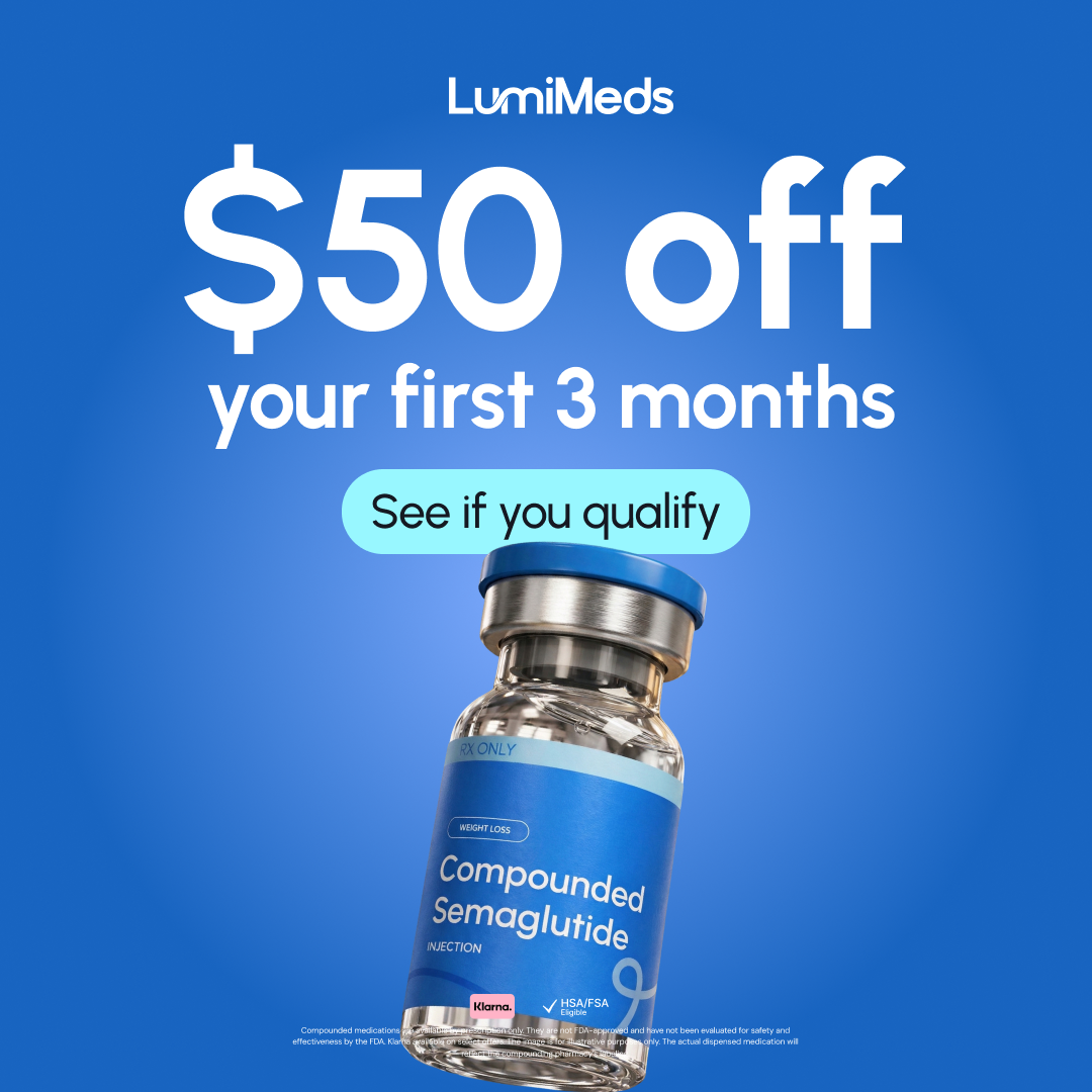
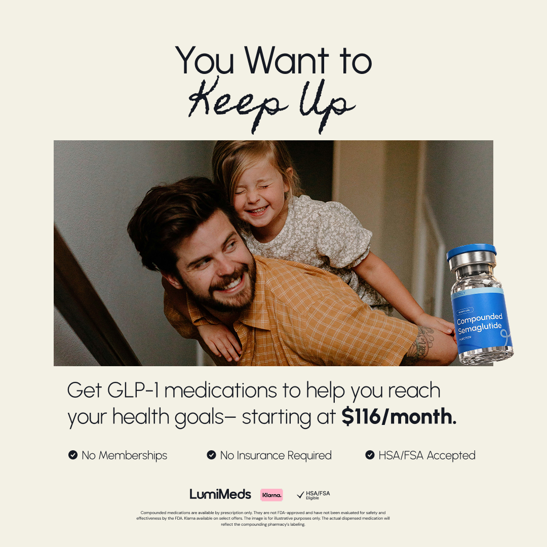
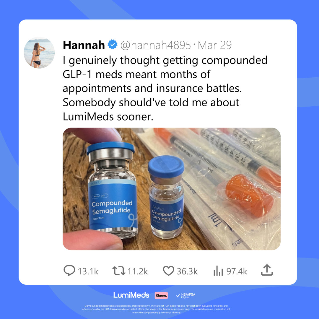
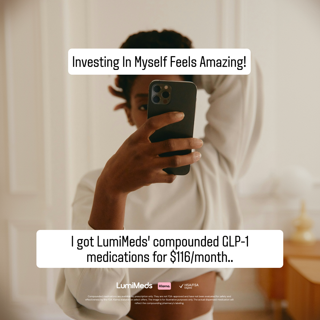
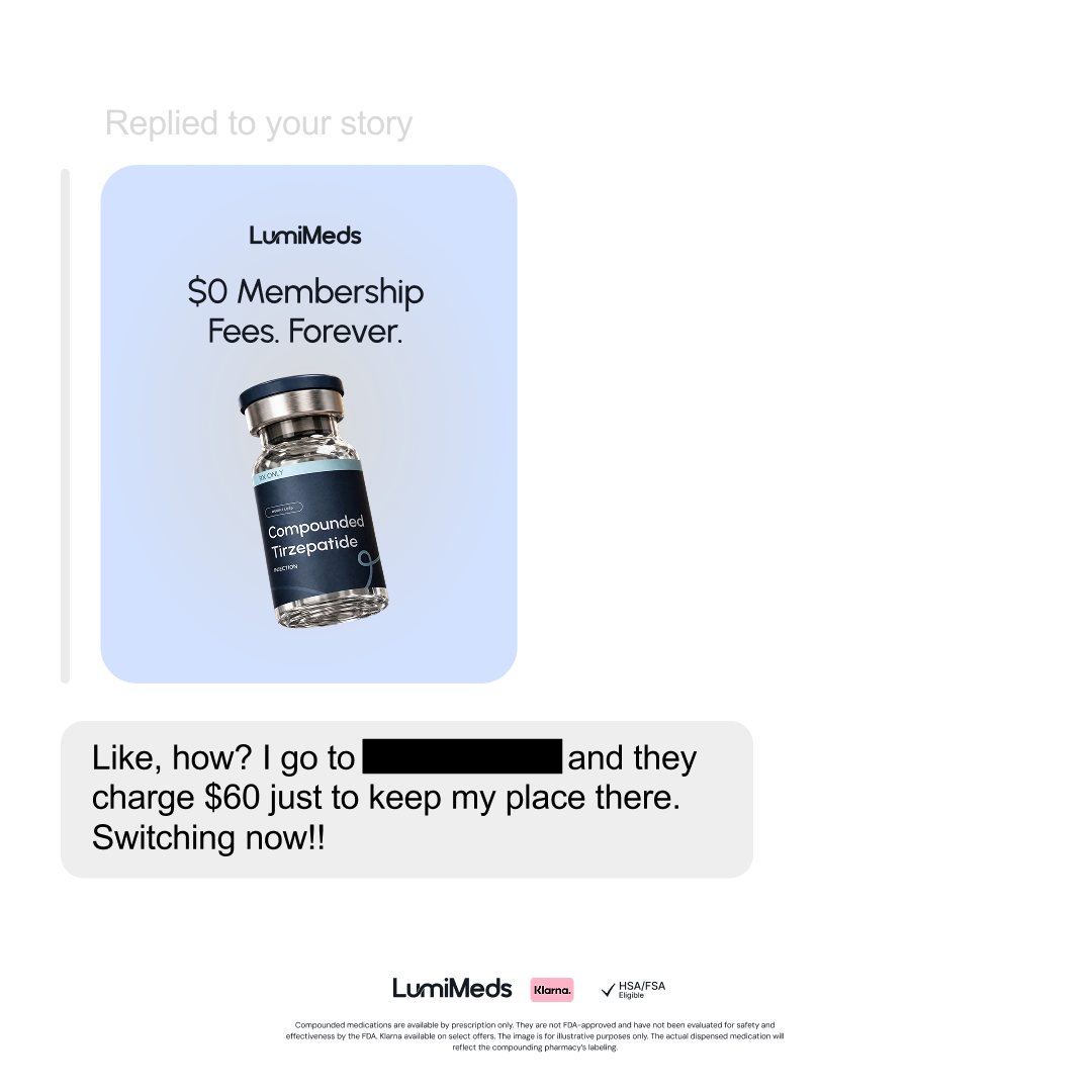
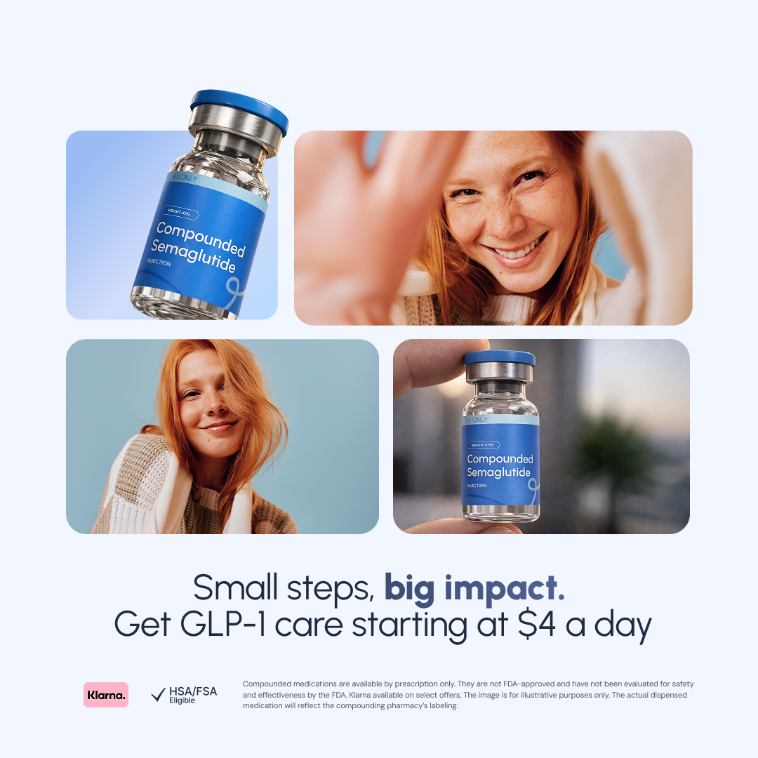
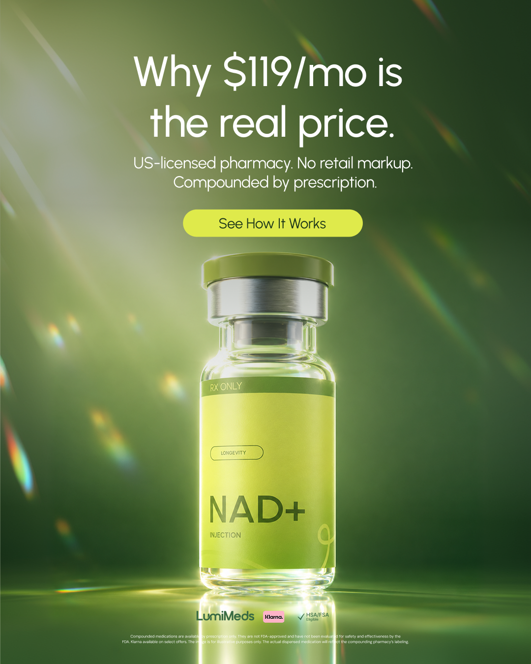
I designed paid media campaigns across digital channels that didn't just look good — they performed. Month over month, my creative ranked among the highest-performing ad sets, hitting a 27% CTR and a cost-per-purchase as low as $12.
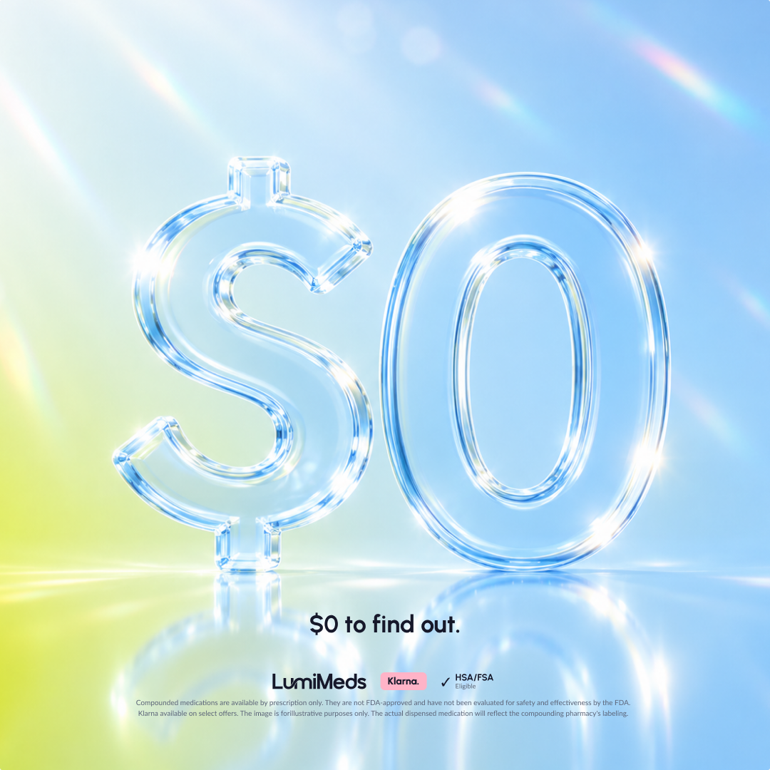
Paid Social Creative
High-converting ad creative for paid social — designed and iterated with CRO principles front of mind, achieving a 27% CTR across top-performing sets.
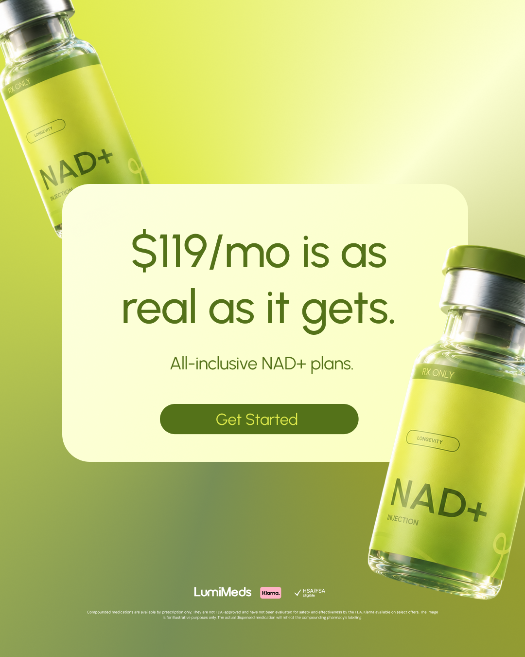
Digital Ad Campaigns
End-to-end campaign design that drove a cost-per-purchase as low as $12 — consistently outperforming benchmarks month over month.
Motion & Video Creative
Motion design and video assets that extended the brand into dynamic formats — built in After Effects and Jitter for maximum production quality.
27%
Click-Through Rate
Achieved across top-performing paid media ad sets
$12
Cost Per Purchase
Lowest CPP achieved — down significantly from pre-rebrand baseline
4
Designers Led
In-house team mentored and managed end-to-end
Leading creative — and raising the bar across the board
Beyond the pixels, I established creative review processes and quality standards across the team, and ran recurring Lunch & Learns on brand application and CRO, raising the output quality of every designer working on the brand.
"Design that doesn't just look right. It performs. Every layout, every decision tied back to what converts."
Leading creative and raising the bar across the board. This isn't a one-off project. I've been embedded in the LumiMeds creative team as Lead Designer, shaping the brand, driving performance, and building the systems and culture that make great work repeatable.